
Are your Google Slides presentations feeling a bit plain? If you want to make them more visually appealing and grab your audience’s attention, creating aesthetic Google Slides can make a big difference. With the right color choices, clean layouts, and interesting visuals, your presentations can stand out.
In this blog post, we’ll show you some simple steps to turn your regular Google Slides into more attractive and eye-catching presentations. Whether you’re a student, professional, or just looking to improve your presentation skills, these tips will help you make slides that are both informative and visually appealing.
What Are The Benefits Of Making Google Slides Appealing?
Making your Google Slides visually appealing offers many benefits, such as:
- Increased Engagement: Attractive slides grab your audience’s attention and keep them focused on the content, making it easier to maintain their interest throughout the presentation.
- Enhances Professionalism: Well-designed slides give your presentation a polished and professional look, reflecting positively on your skills and attention to detail.
- Better Communication: Clear visuals, organized layouts, and thoughtful design make your ideas easier to understand, ensuring that your message gets across effectively.
- Brand Representation: Consistent design and color schemes that align with your brand can help reinforce your brand identity, making your presentation feel more cohesive and memorable.
- More Persuasive: Aesthetically pleasing slides create a positive impression, making your arguments and ideas more convincing and impactful.
- Competitive Advantage: When your slides stand out visually, it gives you an edge over others who may rely on basic, generic designs, helping you leave a lasting impression.
Key Elements for Aesthetic Slides
Creating visually appealing slides requires attention to detail and thoughtful design choices. Here are the key elements that can help you achieve aesthetic slides:
1. Choose a Harmonious Color Palette
A well-thought-out color palette sets the tone for your entire presentation. Choosing colors that complement each other is essential for creating a cohesive and visually pleasing experience.
Stick to a few main colors and ensure they don’t clash. Soft pastels, muted tones, or bold contrasting colors can all work, as long as they create balance rather than overwhelm your audience.
2. High-Quality Imagery
Using high-quality images is important for making your slides look polished and professional. Low-resolution or pixelated images can ruin the visual impact of your presentation.
Whether you’re using photos, illustrations, or graphics, ensure they are clear, relevant, and visually striking. Aesthetic slides often feature images that not only support the content but also improve the overall design.
Learn More: How to Add a GIF to Google Slides: A Step-by-Step Guide
3. Balance and Symmetry
A sense of balance and symmetry helps your slides feel organized and easy to follow. Distribute content evenly across the slide, keeping an eye on spacing and alignment.
Symmetry doesn’t always mean perfect mirror-like layouts, but can include a balance of text, images, and white space that feels pleasing to the eye. An unbalanced slide can feel chaotic and distract from your message.
4. Thoughtful Typography
Choosing the right fonts is just as important as selecting a color palette. Your font should be easy to read, but also add personality to the presentation.
Mix and match fonts carefully, using one for headings and another for body text to create a visually interesting contrast. However, avoid going overboard – sticking to two or three fonts can keep things simple and professional.
5. Consistent Fonts and Styles
Consistency in your fonts and overall style is key to maintaining a polished look throughout your slides. Keep your font sizes, colors, and spacing uniform across all slides.
When headings, body text, and captions follow a consistent format, it creates a sense of cohesion and professionalism. This consistency allows the audience to focus more on your content rather than being distracted by varying styles.
Related Read: How to Add Fonts to Google Slides? A Step-by-Step Guide
6. Embrace Minimalism
Minimalism is about using only what’s necessary, avoiding clutter, and giving each slide room to breathe. This design approach highlights the most important content without overwhelming the viewer with too much information or too many visuals.
Use clean lines, ample white space, and a simple layout to make each element stand out more clearly. Less really can be more when it comes to aesthetic presentations.
7. Establish Visual Hierarchy
Creating a visual hierarchy helps guide the audience’s attention to the most important parts of your slides. You can establish this by using different font sizes, bolding important points, or adjusting the positioning of elements on the slide.
Make sure your headings are clearly distinct from the body text, and that important images or icons are placed prominently. This ensures that your audience knows what to focus on first.
8. Enhance with Icons and Illustrations
Icons and illustrations can bring life to your presentation and make your message more engaging. They can act as visual cues to highlight key points and break up long blocks of text.
Choose simple, clean icons that match the tone of your presentation, and avoid overusing them. Adding relevant illustrations can also make your slides more visually appealing and easier to understand.
Also Read: How to Insert Icons in Google Slides?
9. Subtle Animations and Transitions
Animations and transitions can add a dynamic element to your slides, but they should be used with care. Over-the-top effects can distract from your message, so it’s best to keep them subtle.
Simple fades, slide-ins, or smooth transitions between slides can make your presentation feel more polished without overwhelming your audience. These effects should support your content, not take attention away from it.
Pro Tip: Use SlidesAI’s QuickAnimate to animate your slides with keyboard shortcuts.
10. Maintain Design Consistency
Consistency across your slides is crucial for maintaining a professional look. This includes using the same layout, color scheme, font choices, and visual style from start to finish.
Maintaining a consistent design helps support your message and prevents your audience from being distracted by sudden changes in design. This uniformity also ensures that your presentation feels cohesive and easy to follow.
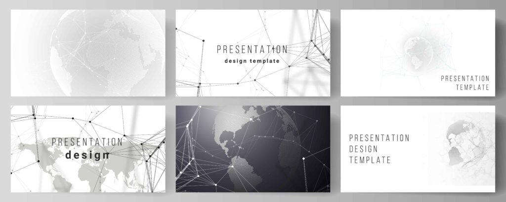
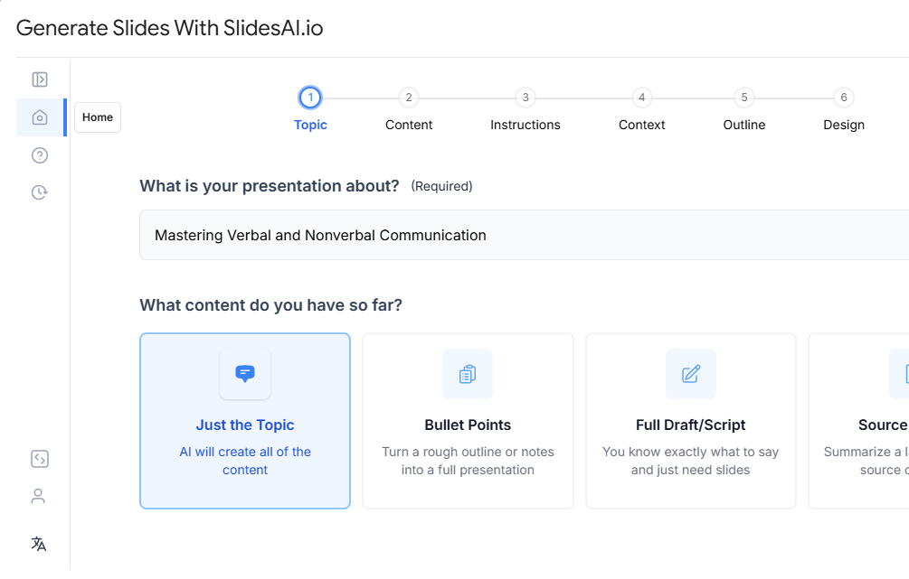
11. Use Design Templates
Starting with a pre-designed template can make your slide creation process faster and easier, while still allowing you to maintain an aesthetic look. Platforms like SlidesAI offer a variety of templates tailored to different themes and styles.
These templates give you a head start, ensuring a professional design, and you can still customize them to fit your specific needs. You can adjust the color schemes, fonts, and layouts to match the aesthetic you’re aiming for, which saves time and effort while still giving your presentation a unique and polished look.
12. Seek Feedback and Iterate
Creating aesthetic slides is a process that can be improved with feedback. Once you’ve designed your slides, share them with colleagues, friends, or even your target audience to get their opinions on the design and clarity of your message.
Constructive feedback can help you identify areas that may need adjustment, whether it’s the color scheme, font choices, or overall layout. After gathering feedback, take the time to refine your slides, making small tweaks that enhance the overall visual appeal and effectiveness of your presentation.
Iteration ensures that your slides are polished and engaging. If you need further expert guidance, mentoring software can offer personalized feedback and help elevate your skills.
Create Presentations Easily in Google Slides and PowerPoint
14M+Installs
Closing Thoughts
Incorporating aesthetic design into your Google Slides can greatly improve the impact of your presentations. By paying attention to color, layout, and visual balance, you can create slides that are both engaging and professional. With these simple tips, your presentations will not only look better but also leave a lasting impression on your audience.
Frequently Asked Questions (FAQs)
How can I improve my typography skills?
Experiment with different font combinations, pay attention to font sizes and weights, and consider using typography tutorials for guidance.
How much Animations should I use?
While animations can be effective, use them sparingly. Too many animations can be distracting and unprofessional.
How can I make my slides more engaging?
Incorporate storytelling elements, use interactive elements, and vary the content format to keep your audience interested.
Is it okay to use multiple fonts in a presentation?
It’s best to stick to one or two fonts to maintain a cohesive and professional look. Too many fonts can make your slides look cluttered and unorganized.
What makes Google Slides look aesthetic?
Aesthetic Google Slides use balanced layouts, consistent colors, readable fonts, high-quality visuals, and minimal text to create a clean and engaging design.
Which fonts are best for aesthetic Google Slides?
Popular choices include Montserrat, Poppins, Lato, Playfair Display, and Open Sans. Stick to one or two fonts for a polished look.
Can beginners create aesthetic Google Slides?
Yes. By using templates, basic design principles, and AI tools, beginners can easily create professional-looking slides.
Are templates better than designing from scratch?
Templates save time and ensure design consistency, making them ideal for users who want quick and aesthetic results.
How many colors should I use in Google Slides?
Using 2–3 main colors and one accent color is ideal for maintaining visual balance.
Do animations make slides look better?
Yes, when used subtly. Simple transitions enhance flow without distracting the audience.