Captivate your audience with impactful presentations using the 7×7 rule. This design principle encourages a clear and focused approach by limiting slides to a mere 7 lines of text, each containing a maximum of 7 words. By adhering to this format, you can craft presentations that are not only easy to digest but also leave a lasting impression on your viewers. Let’s jump into the article and find out how it works.
What is the 7×7 rule in PowerPoint Slide?
As discussed earlier, keeping presentations clear and engaging is the goal of the 7×7 rule. This means limiting each slide to around seven lines of text (excluding the title) with each line containing roughly seven words. This helps focus the audience on the main points.
While the specific number (7) might have some flexibility (some suggest 8 lines or 6 lines), the key idea is to prioritize clarity and avoid overwhelming viewers with too much information. Images can still be included to enhance understanding.
Ultimately, the 7×7 rule aims to make presentations more like conversation starters, sparking focused discussions rather than simply dumping information. This saves valuable time and ensures the audience is engaged with the most relevant and actionable content. It’s important to remember that this rule serves as a guideline, rather than a strict requirement.

How to apply the 7×7 rule in PowerPoint?
1. One Slide, One Point:
Ensure each slide focuses on just one main idea or message to avoid overwhelming your audience.
2. Keep it Simple:
Simplify your slides by avoiding complicated graphs or too much text. Clear, concise points make your presentation easier to follow.
3. Use Large and Readable Fonts:
Ensure that the text on your slides is large enough for everyone in the audience to read comfortably, even from a distance.
4. Maintain Consistent Formatting:
Keep your presentation visually coherent by using consistent fonts, colors, and layouts throughout. This creates a polished and professional look.
5. Leverage Visuals Effectively:
Add pictures, charts, and diagrams to help illustrate your points and make your presentation more engaging.
6. Practice Your Delivery:
Run through your presentation a few times to get comfortable with the flow, ensure clear communication, and get the timing right.
7. Engage Your Audience:
Encourage your audience to participate by asking questions and involving them in discussions throughout your presentation.
Create presentation slides with AI in Seconds in Google Slides
15M+Installs
Works with Google Slides
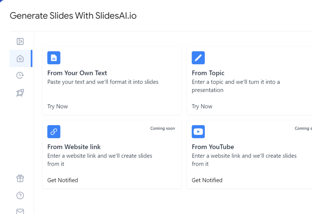
Example of 7×7 Powerpoint Presentation
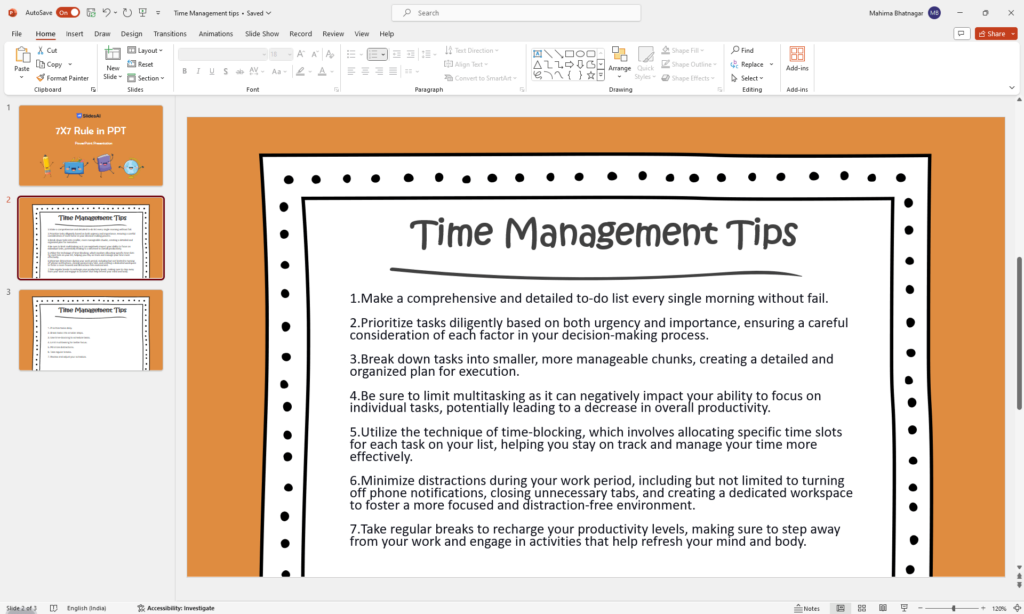
Let’s consider a presentation about “Effective Time Management Techniques”. We’ll start with a slide that doesn’t adhere to the 7×7 rule, followed by a revised slide that does follow the rule.
Slide Without 7×7 Rule:
Slide Title: Time Management Tips
Bullet Points:
- Make a comprehensive and detailed to-do list every single morning without fail.
- Prioritize tasks diligently based on both urgency and importance, ensuring a careful consideration of each factor in your decision-making process.
- Break down tasks into smaller, more manageable chunks, creating a detailed and organized plan for execution.
- Be sure to limit multitasking as it can negatively impact your ability to focus on individual tasks, potentially leading to a decrease in overall productivity.
- Utilize the technique of time-blocking, which involves allocating specific time slots for each task on your list, helping you stay on track and manage your time more effectively.
- Minimize distractions during your work period, including but not limited to turning off phone notifications, closing unnecessary tabs, and creating a dedicated workspace to foster a more focused and distraction-free environment.
- Take regular breaks to recharge your productivity levels, making sure to step away from your work and engage in activities that help refresh your mind and body.
Analysis:
- This slide is a mess! It’s overloaded with lengthy sentences and unnecessary explanations.
- People might get lost in all the words and lose interest in what the presenter is saying.
- The cluttered appearance of the slide makes it hard to focus on the main points.
- It lacks visual appeal and looks chaotic.
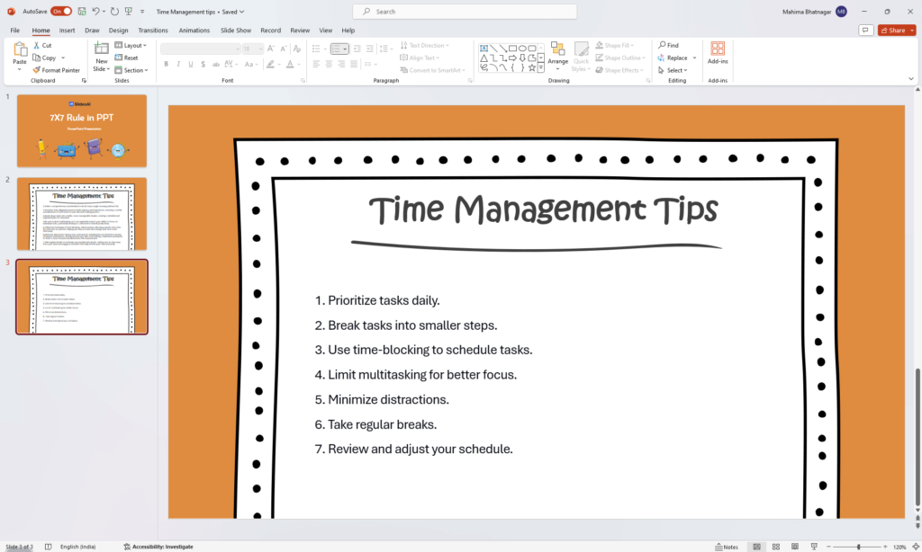
Slide With 7×7 Rule:
Slide Title: Time Management Tips
Bullet Points:
- Prioritize tasks daily.
- Break tasks into smaller steps.
- Use time-blocking to schedule tasks.
- Limit multitasking for better focus.
- Minimize distractions.
- Take regular breaks.
- Review and adjust your schedule.
Analysis:
- This slide follows the 7×7 rule, keeping things short and sweet.
- Less text means people can focus on what the presenter is saying.
- It looks clean and simple, making it more visually appealing.
- It’s easy for the audience to understand quickly.
How the Rule Makes the Slide Better:
- Easier to Understand: With fewer words, it’s easier for the audience to get the main points.
- More Engaging: Less text means the presenter can talk more and keep the audience’s attention.
- Rememberable: People are more likely to remember the key tips with a simpler slide.
- Looks Professional: Following the 7×7 rule shows professionalism and respect for the audience’s time.
Create presentation slides with AI in Seconds in Google Slides
- No design skills required
- 3 presentations/month free
- Don’t need to learn a new software
Works with Google Slides
Closing Thoughts
The 7×7 rule is a simple yet effective way to make your presentations more engaging. By keeping your slides clear and concise with strong visuals, you’ll help your audience understand the key points and remember them easily. This approach will not only ensure your message gets across but also encourage interaction and discussion. So, put the 7×7 rule to the test and watch your presentations come alive!
Ready to create presentations that captivate your audience? Visit SlidesAI today and discover how AI can help you craft compelling presentations that follow the 7×7 rule: https://slidesai.io/
Frequently Asked Questions:
1. Is the 7×7 rule a must-follow rule?
The 7×7 rule is more like a helpful tip than a strict requirement. You can adjust it as needed for your presentation. However, keeping the text short and clear is still very important.
2. What if I have a lot to share?
Consider splitting the information across multiple slides. You can also use charts and graphs to show complex data in an easy-to-understand way.
3. Does the 7×7 rule count the slide title?
No, the 7×7 rule usually doesn’t apply to the slide title. Keep the title short and clear, highlighting the main point of the slide.
4. What font size should I use?
Choose a font size that’s big enough for everyone in the audience to read easily, especially those seated further away. A size between 18 and 24 is generally a good choice.
5. Are there other design things to keep in mind?
Yes. Using a consistent style throughout your slides, including clear pictures or graphs, and having a simple color scheme can make your presentation look better and more professional.
6.Are there other options similar to the 7×7 rule?
Some people prefer using similar rules like the 6×6 rule or the 10×5 rule. The main goal is to keep your content short and interesting. Try different things to see what works best for your specific presentation and the audience you’re presenting to.
