Templates
Infographics
Venn Diagram Presentation Templates for Google Slides and PowerPoint Presentation
Venn Diagram Presentation Templates for Google Slides and PowerPoint Presentation


What is the Venn Diagram Template?
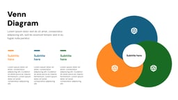
The Venn diagram is a staple in presentations, often used instead of bullet points to visually represent ideas. First introduced by John Venn in 1880, these diagrams were designed to map out relationships between different sets of information in a clear and structured way.
By using overlapping circles, a Venn diagram illustrates the connections, similarities, and differences between two or more groups. This simple yet powerful visual tool can lead to fresh insights, better decision-making, and stronger arguments by organizing complex data in an easy-to-understand format.
<SlidesAICTA1/>
How are Venn Diagram Templates Used?
While you must have heard and used Venn diagrams before during your school days, these are not just overlapping circles. In real life as well, you can make great use of the Venn diagram templates. Here are some ways to do that:
- Data Comparison: With the help of a Venn diagram template, you can easily spot what is common and what is unique between multiple data sets without getting lost in numbers and text.
- Concept Relationships: Whether you are brainstorming ideas or trying to understand how different concepts are linked, Venn diagrams help visualize connections, making complex topics easier to grasp.
- Market Analysis: Businesses use Venn diagrams to see where different customer groups overlap, helping them fine-tune their strategies and target the right audience more effectively.
- Team Collaboration: Working on a group project? A Venn diagram helps map out everyone’s roles and responsibilities, showing where tasks overlap and making teamwork smoother.
- Strategic Planning: When planning goals and resources, Venn diagrams highlight where things align and where there are gaps, helping teams make better decisions and stay on track.
What Makes SlidesAI’s Venn Diagram Templates Special?
- Pre-Designed Slides: Save significant time by starting with pre-built templates instead of designing each slide from scratch. This allows you to focus on refining your content and message.
- Customization Freedom: While templates offer a strong starting point, SlidesAI templates allow for full customization of layouts, fonts, colors, and content to match your specific needs and brand identity.
- AI-Powered: Leverage AI to instantly edit and customize slides based on your content (on Google Slides). Simply input your text outline or key points, and SlidesAI will create visually appealing slides with appropriate layouts, fonts, and images.
- Style Consistency: Maintain a consistent visual style throughout your presentation with pre-defined themes and color palettes within the templates.
- Professional Look: SlidesAI’s templates ensure a polished and professional look compared to presentations built from scratch, even for non-designers.
How to Use These Venn Diagram Templates?
- Microsoft Powerpoint: Click on Download > Click on “PowerPoint” > Click on the downloaded file to make a copy and start customizing/editing the template
- Google Slides: Click on Download > Click on “Google Slides” > Click on “Use Template” to make a copy and start customizing/editing the template
Create presentations in seconds. Enter text and SlidesAI creates customizable slides based on that text in seconds that goes well with all our templates too
Tips for Venn Diagram Presentation Slides
When using Venn diagram templates in Google Slides or PowerPoint, here are some tips to keep in mind:
Design Tips
- Keep it Simple: Stick to a maximum of two to three as too many can turn your diagram into a confusing tangle instead of a useful visual.
- Simplify Circle Labels: Use short, clear labels that get the point across instantly. Long, complicated text will just clutter things up.
- Highlight Overlaps: The real magic of a Venn diagram happens in the overlapping sections, so make sure they stand out to clearly show shared elements.
- Use Distinct Colors: Pick contrasting colors so the circles and their intersections pop. You want to avoid everything blending together into one big blob.
- Adapt Layout for Content: Adjust circle sizes and placements based on the information you are presenting. A well-balanced layout makes it easier to read and understand.
Content Tips
- Define the Core Categories: Start by deciding what each circle represents and label them clearly. If your categories are not well-defined, the whole diagram loses its purpose.
- Focus on Key Relationships: Not everything needs to be included! Highlight only the most meaningful overlaps so your audience can quickly grasp the main connections.
- Use Concise Text: Keep labels and descriptions short and simple. A cluttered Venn diagram defeats the whole point of visualizing information.
- Prioritize Relevant Data: Stick to facts, examples, and insights that truly matter to your categories. Irrelevant details only make things messy.
- Be Clear About Differences: Make sure each category has unique aspects. This helps provide a full picture of the comparison.
Technical Tips
- Adjust the Circle Size for Clarity: Make sure your circles are big enough to fit all the necessary content without cramping the text.
- Ensure Proper Overlap Proportions: The size of the overlaps should reflect the actual relationships or data. If two categories share a lot, their overlap should be bigger.
- Set Transparent Overlap Areas: Use transparency in the overlapping sections so that all categories stay visible without weird color mixing that makes things harder to read.
- Lock Circle Placement: Once you have arranged your circles perfectly, lock them in place. This prevents accidental shifting when making edits or presenting.
- Optimize for Screen Sizes: Test your diagram on different screens to make sure it stays clear and legible.
<SlidesAICTA2/>
Frequently Asked Questions (FAQs)
Can I use Venn diagrams for business presentations?
Yes, Venn diagrams are useful for business presentations as they visually compare strategies, products, or market segments clearly and engagingly.
Can I customize the colors in a Venn diagram template?
Yes, you can modify the circle and overlap colors to match your presentation’s design.
How can I make the overlapping areas clearer in my Venn diagram?
Increase transparency or use contrasting colors to highlight overlapping sections effectively.
What are the five types of Venn diagrams?
Here are five common types of Venn diagrams:
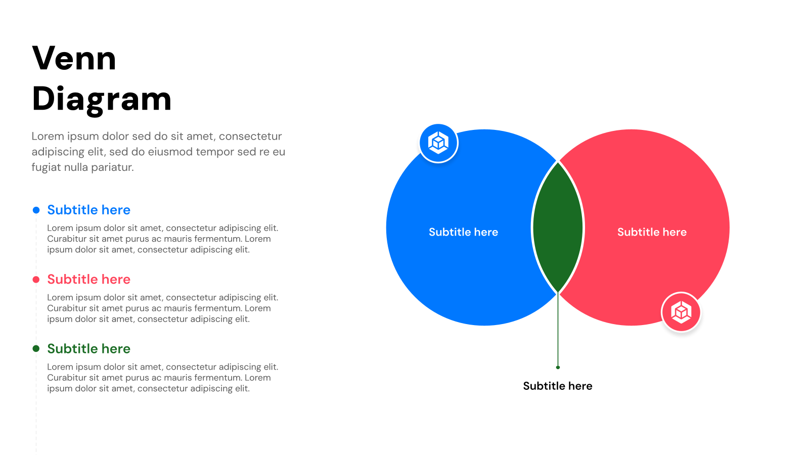
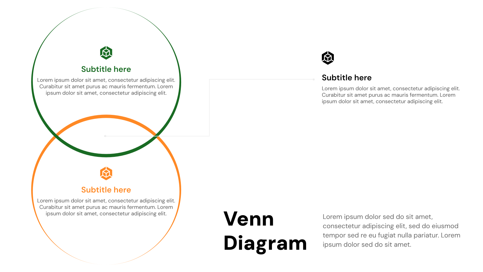
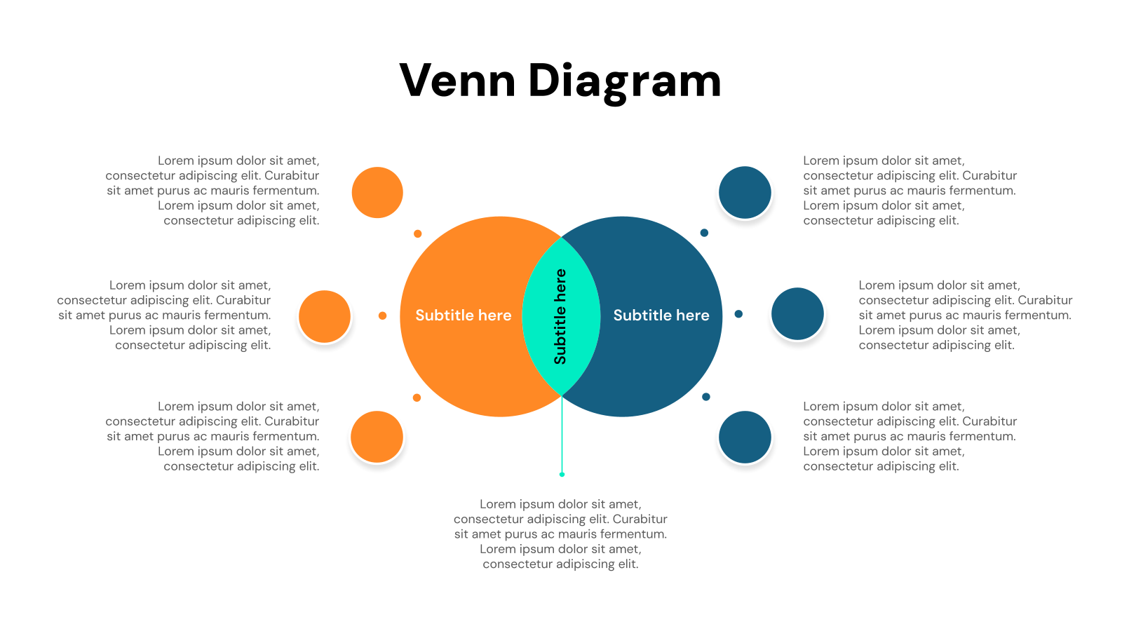
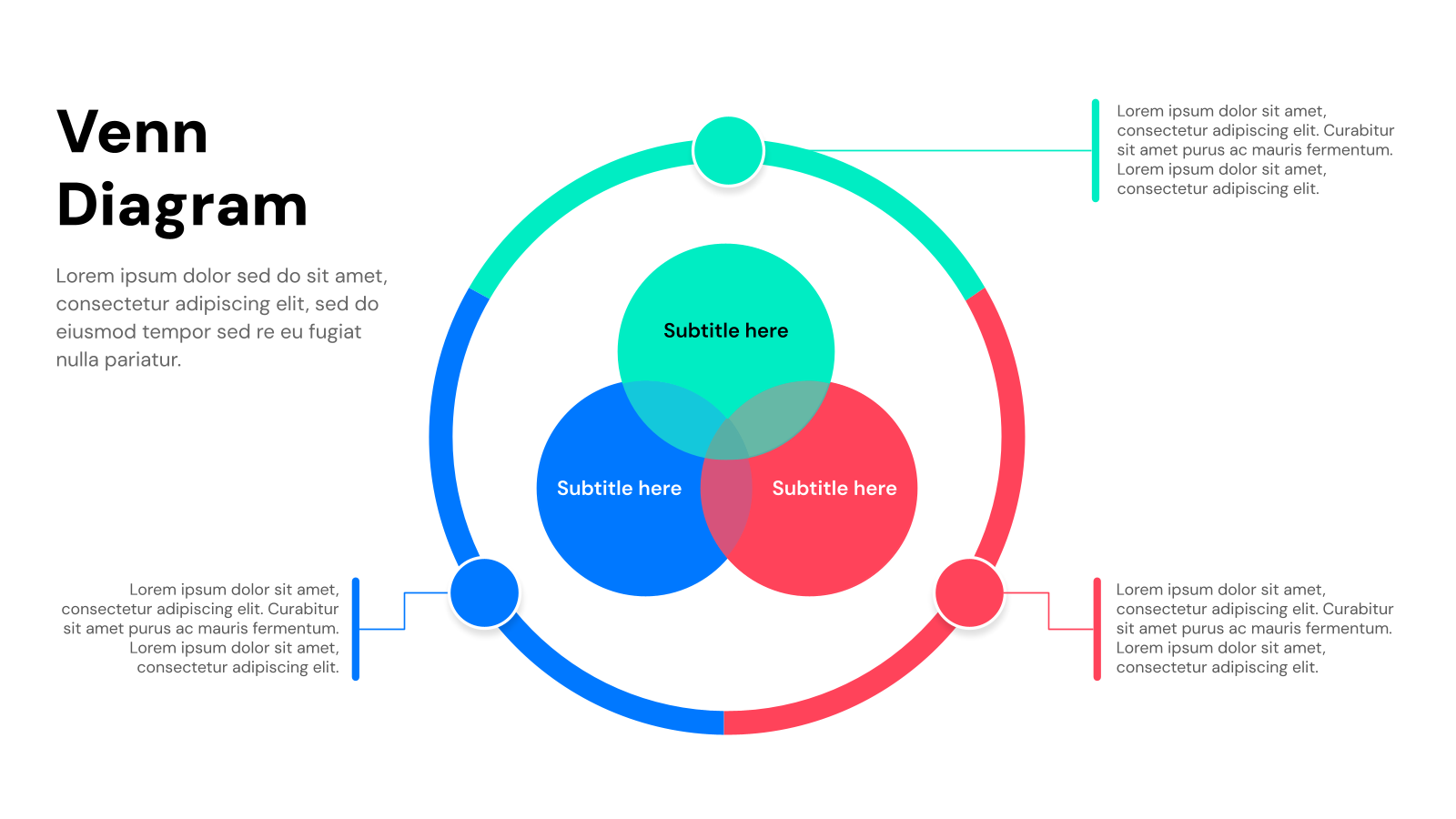
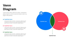
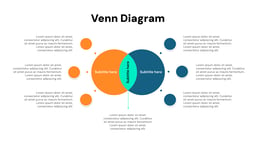
- Two-Circle Venn Diagram: Compares two sets with a single overlap.
- Three-Circle Venn Diagram: Illustrates relationships among three sets.
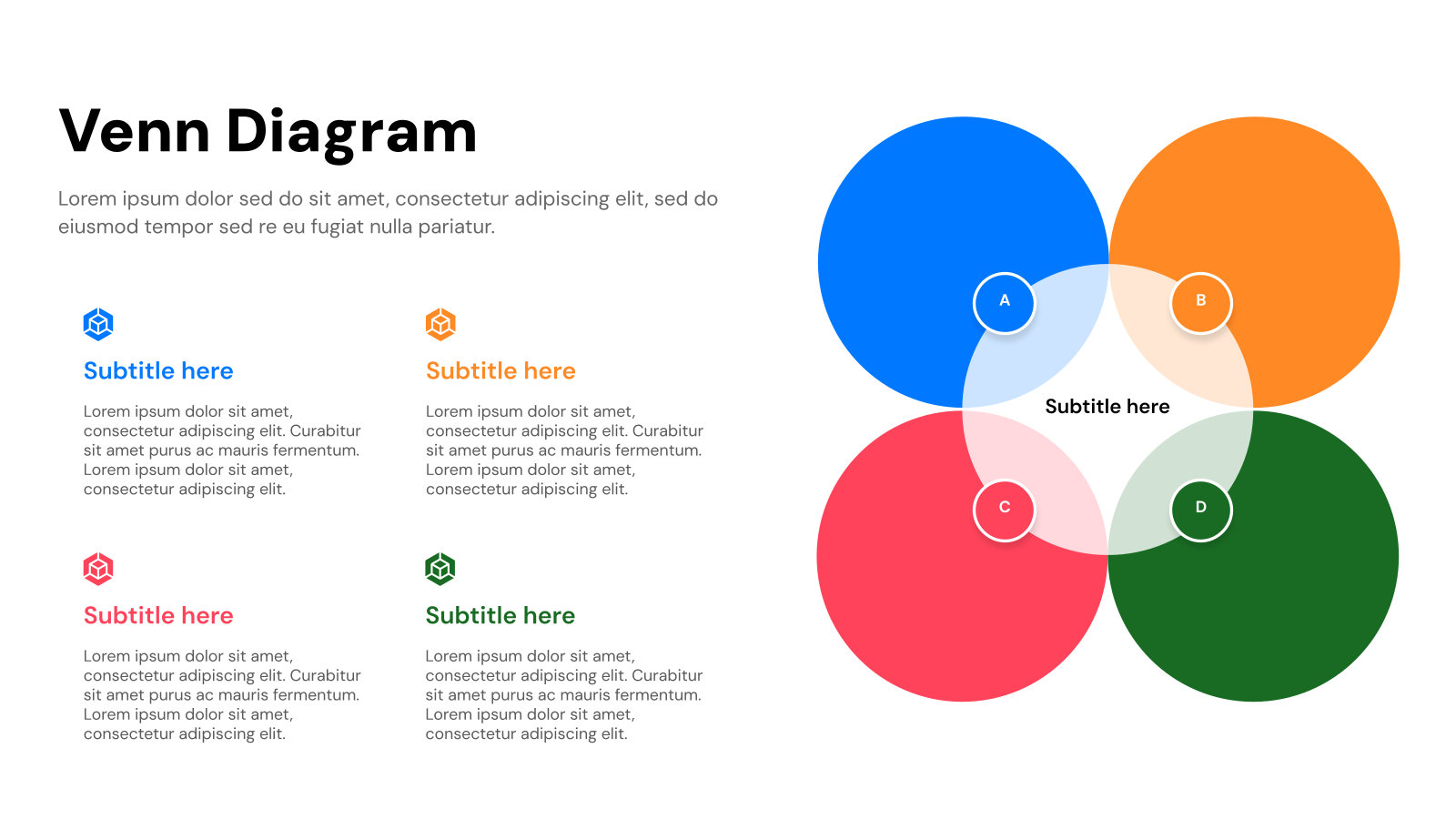
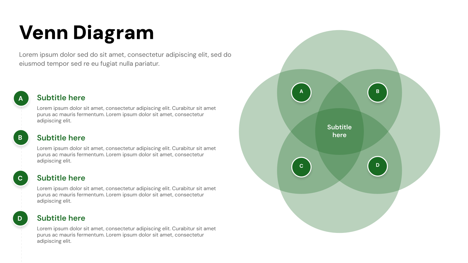
- Four-Circle Venn Diagram: Represents four sets with multiple overlaps.
- Universal Set Venn Diagram: Features a rectangle to include the universal set.
- Euler Diagram: Similar to a Venn diagram but may include non-overlapping sets.


© This template can be used for both personal and commercial purposes. However, any form of reselling or redistribution of this template is strictly prohibited.

Create Presentation Slides with AI in seconds
Design stunning, unique slides with AI-generated visuals and text. Say goodbye to boring templates with our free AI presentation maker