
A well-chosen background can transform your ordinary presentation into an extraordinary one. It’s more than just a pretty picture – it’s a powerful tool that sets the mood, engages your audience, and makes you stand out. A visually appealing background can create a lasting impression, helping you deliver a memorable and impactful presentation.
In this blog, we’ll dive into the art of background design, providing practical tips and tricks to help you create slides that are not only informative but also visually stunning.
Why Do Backgrounds Matter in Presentation Design?
The background of your presentation acts as the foundation for delivering your message. It influences the mood, sets the tone, and helps your audience connect with the content. A well-chosen background should support your main message, making it clearer and more memorable.
For example, if you’re introducing a new product, using a background with the product’s logo or colors can reinforce the brand.
Alternatively, when presenting detailed data, a simple and uncluttered background can help your audience focus on the information without distractions. Selecting the right background can significantly impact how your presentation resonates with your audience.
Create Presentations Easily in Google Slides and PowerPoint
14M+Installs
How to Make the Background More Appealing in Slides?
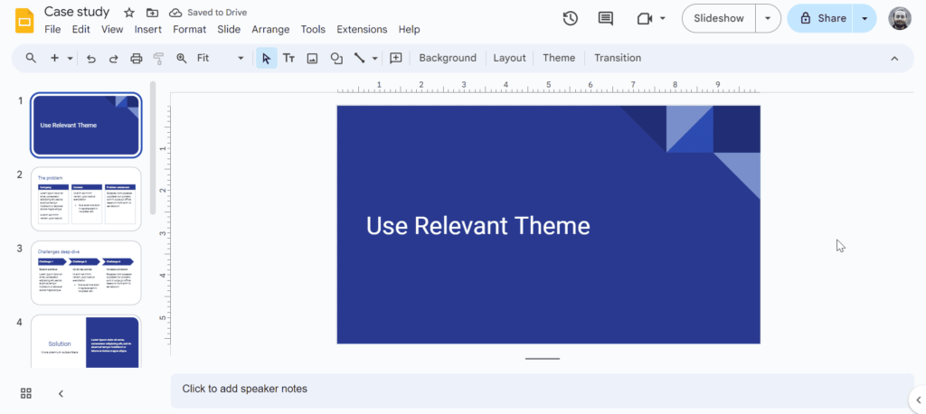
1. Choose a Relevant Theme
A well-chosen theme can instantly set the tone for your presentation. It should align with your topic and convey the right message to your audience. For instance, a professional theme might be suitable for a business presentation, while a playful theme could be ideal for a casual presentation.
Google Slides offers a variety of built-in themes that can be easily customized to suit your needs. These themes often come with pre-designed layouts, colors, and fonts, saving you time and effort. If you’re looking for even more options, consider using plugins like SlidesAI with Google Slides.
SlidesAI provides access to a vast library of templates, allowing you to find the perfect theme for your presentation. Whether you need something professional, creative, or casual, there’s a theme out there to match your style.
2. Use High-Quality Images
Images can add a visual appeal to your slides, but ensure they are high-resolution and relevant to your content. Avoid blurry or pixelated images, as they can distract from your presentation. Opt for images with clear and sharp details.
A good rule of thumb is to use images that are at least 300 DPI (dots per inch) for slides that will be projected. To add an image to your slide background:
- Open your Google Slides presentation.
- Select the slide you want to change.
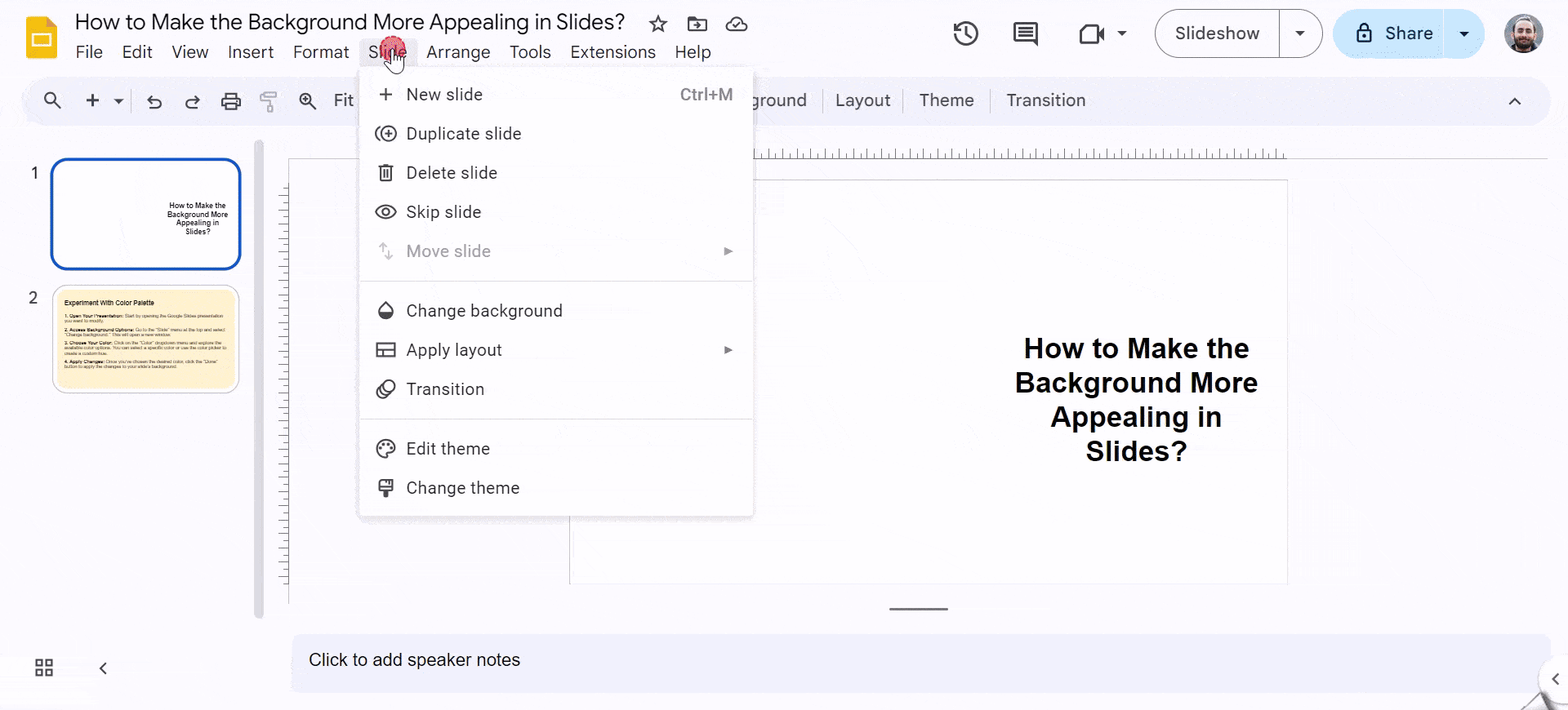
- Go to “Slide” in the top menu and click on “Change background.” A new window will appear.
- Choose your image source. You can upload an image from your computer, use a webcam, link to an image online, or select a photo from your Google Photos or Google Drive.
- Select the desired image and click on the “Done” button to apply it as the background.
Related Read: How to Change Background on Google Slides?
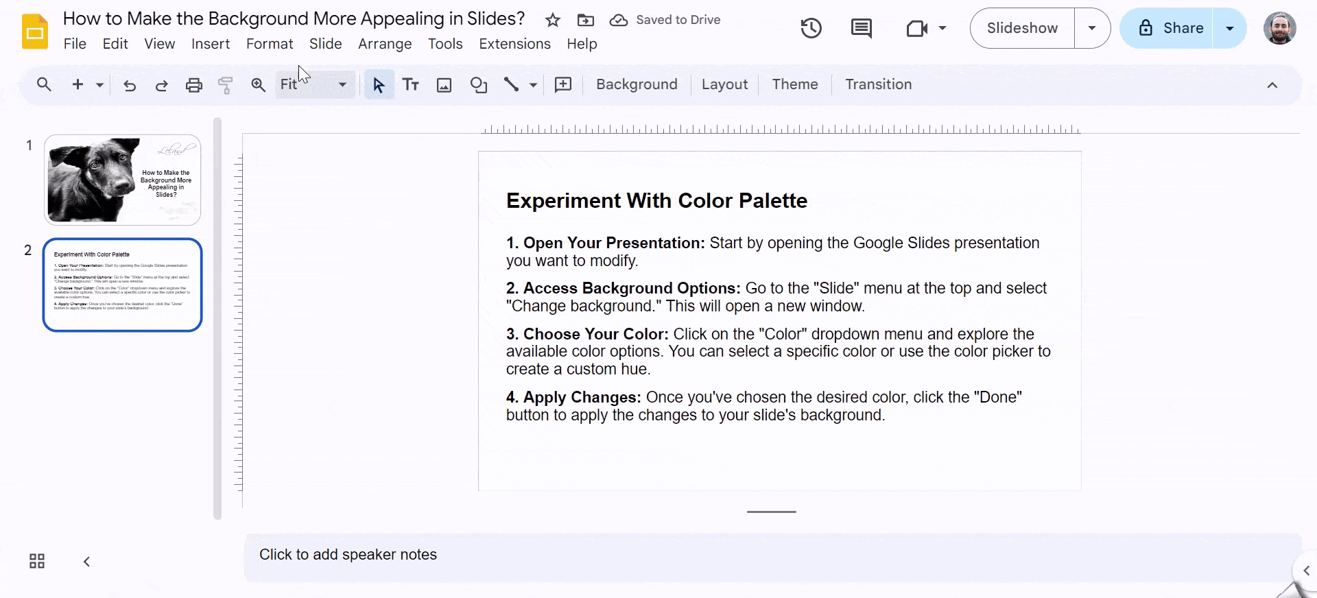
3. Experiment with Color Pallete
The right color palette can dramatically enhance the visual appeal of your slides. When playing around with your color palette make sure you remember these points:
- Choose a Color Palette that Complements Your Content: The colors you choose should enhance your message and make it easier to read. For instance, a dark background with light text is often easier on the eyes.
- Consider the Psychology of Colors: Different colors evoke different emotions. For example, blue is often associated with trust and reliability, while red can symbolize energy and excitement. Choose colors that align with the tone and message of your presentation.
- Avoid Using Too Many Colors: A cluttered slide with multiple colors can be overwhelming and difficult to focus on. Stick to a limited color palette for a cleaner and more professional look.
To change the background color in your Google Slides presentation, follow these steps:
- Open Your Presentation: Start by opening the Google Slides presentation you want to modify.
- Access Background Options: Go to the “Slide” menu at the top and select “Change background.” This will open a new window.
- Choose Your Color: Click on the “Color” dropdown menu and explore the available color options. You can select a specific color or use the color picker to create a custom hue.
- Apply Changes: Once you’ve chosen the desired color, click the “Done” button to apply the changes to your slide’s background.
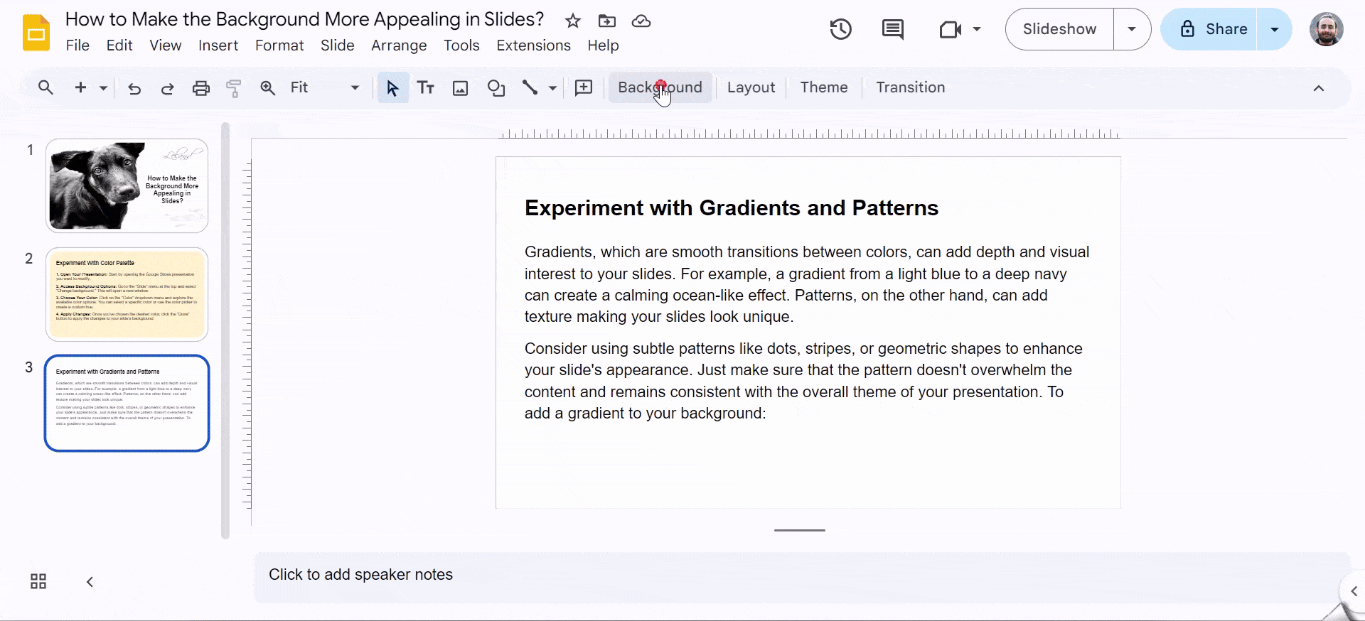
4. Experiment with Gradients and Patterns
Gradients, which are smooth transitions between colors, can add depth and visual interest to your slides. For example, a gradient from a light blue to a deep navy can create a calming ocean-like effect. Patterns, on the other hand, can add texture making your slides look unique.
Consider using subtle patterns like dots, stripes, or geometric shapes to enhance your slide’s appearance. Just make sure that the pattern doesn’t overwhelm the content and remains consistent with the overall theme of your presentation. To add a gradient to your background:
- Select the slide: Click on the slide you want to modify.
- Access the background options: Go to the “Design” tab and click on “Format Background.”
- Choose gradient fill: In the “Format Background” pane, select “Gradient fill.”
- Customize your gradient: You can adjust the colors, direction, and angle of the gradient to suit your preferences.
By experimenting with different gradient or pattern combinations, you can create stunning and eye-catching backgrounds that enhance your presentation.
5. Use Transparency
Consider using transparency when you have a compelling image or background that you want to showcase, but you also need to add text or other elements. It’s also useful for creating subtle effects like fading or blending elements together. By making an image background transparent, you can create a layered effect that allows the background to shine through while still providing a platform for your content. This can make your slides more visually appealing and less cluttered.
Read More: How to Make an Image Transparent in Google Slides?
6. Maintain Consistency
Keeping a consistent background throughout your presentation is important for achieving a unified and professional appearance. It helps to connect your slides visually, allowing the viewer’s attention to flow smoothly from one slide to the next. Additionally, a consistent background reinforces your brand identity and supports the overall message you want to convey.
Related Read: How to Blur Background in Google Slides?
7. Keep It Simple
When creating presentation slides, it’s important to keep the background simple. Busy or flashy backgrounds can easily distract your audience from the main content of your presentation. If there’s too much going on in the background, people might focus more on the design than on what you’re saying.
A simple background helps keep the attention on your message, making it easier for your audience to follow along and understand your points. Keeping things minimal ensures that your content stands out and is clearly communicated.
Build Stunning Slides in Seconds with AI
- No design skills required
- 3 presentations/month free
- Don't need to learn a new software

Closing Thoughts
A well-designed background can elevate your presentation, making it more engaging and memorable. By choosing relevant themes, using high-quality images, and maintaining simplicity, you can create slides that not only look great but also support your message. Keep experimenting with different elements to find what works best for your content.
Frequently Asked Questions
1. When should I use a solid color background?
Solid color backgrounds offer a clean and minimalist aesthetic, perfect for highlighting text or images. Their versatility allows you to create a specific mood or match your brand identity. They are ideal when you want to focus attention on your content rather than the background itself.
2. What kind of images should I use for a background?
Opt for high-quality images that align with your presentation’s topic and evoke the desired mood. Ensure the image complements your content without overwhelming it, and prioritize the readability of text overlaid on the image.
3. How do I avoid color clashes in my background?
To avoid color clashes, use color palettes or online tools to ensure harmonious combinations. Consider the contrast between colors and how they interact with each other, aiming for a visually pleasing and accessible design.
4. Can I use animations on my background?
Use background animations sparingly. While they can add visual interest, excessive movement can be distracting and hinder content comprehension. Prioritize clear communication over flashy effects.
5. Should I use a dark or light background?
Whether to use a dark or light background depends on several factors. Dark backgrounds can create a modern, sophisticated look and reduce eye strain in low-light conditions. Light backgrounds are generally easier to read and create an airier feel. Ultimately, the best choice depends on your content, audience preferences, and desired mood.