In corporate presentations, diagrams play a crucial role in simplifying complex information. Venn diagrams, specifically, are great for comparing data and showing similarities or differences.
They make your presentation more visually appealing and help keep your audience interested. By including a Venn diagram, you can effectively communicate important points and make your content more engaging.
To ensure your data is presented effectively, let’s look at how to create a Venn diagram in Google Slides.
What Is a Venn Diagram?
A Venn diagram is a helpful visual tool used to show how different groups or sets relate to each other. It uses circles that overlap to illustrate which items belong to each group and which ones are shared between multiple groups. This allows for easy comparison and contrast of the commonalities and differences among the selected groups.
Key Components of a Venn Diagram:
- Sets: These are collections of items or categories.
- Elements: These are the individual items within each set.
- Intersection: This is the area where sets overlap, indicating common elements shared by two or more sets.
- Universal Set: This encompasses all the elements included in the diagram and is typically depicted as a rectangle surrounding the sets.
When you are making diagrams in Google Slides you must remember:
- Each circle in the diagram represents a distinct set of elements.
- Overlapping areas highlight relationships between elements from different sets.
How to Make a Venn Diagram on Google Slides?
Google Slides offers two methods for creating Venn diagrams: the Shape tool and Diagrams. Let’s take a detailed look at them below.
Method 1: Create a Google Slides Venn Diagram using the Shape Tool
Here’s how to create a Venn diagram in Google Slides using the Shapes tool:
- Open your presentation and create a new slide.
- Go to the Insert menu and select Shapes.
- Choose Ovals from the Shapes submenu.
- Click and drag on the slide to create the first circle. While dragging, hold Shift to create a perfect circle.
- Repeat step 4 to create a second circle overlapping the first one. You’ll need to adjust the position of the circles to form the Venn diagram shape.
- To create the overlapping area in the center, you can:
- Use the transparency feature. Select both circles, then go to Format > Fill color > Custom. Use the transparency slider to make the overlapping area clear.
- Create a third circle entirely within the overlap area of the first two circles. Fill this circle with a different color to visually distinguish it.
- Add Labels to your Venn diagram. Go to Insert > Text box and click on the slide to create a text box. Type your label and position it within the appropriate area of the Venn diagram (inside one circle, the overlap area, or outside both circles). Repeat for all your labels.
- Customize the appearance of your Venn diagram using the formatting options available in the top menu bar. You can change the fill color, border color, and line weight of the shapes.

Create presentation slides with AI in Seconds in Google Slides
14M+Installs
Works with Google Slides

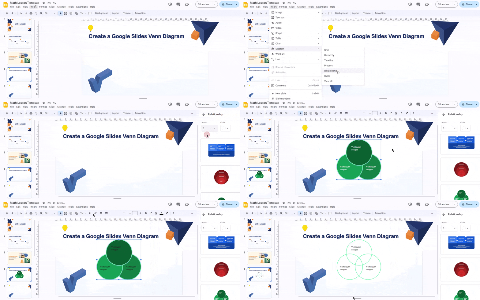
Method 2: Create a Google Slides Venn Diagram using Diagrams
Here’s how to create a Venn diagram in Google Slides using the Diagrams feature:
- Open your presentation and navigate to the slide where you want the Venn diagram.
- Go to the Insert menu and select Diagrams.
- A panel titled “Choose a Diagram” will appear on the right side of your slide. Click on the Relationships category.
- Within the Relationships category, you’ll see various Venn diagram layouts. Choose the one that best suits your needs (two circles, three circles, etc.).
- You might see an Areas drop-down menu next to some layouts. This allows you to specify the number of circles you want in your Venn diagram (useful for three-circle Venn diagrams).
- Clicking on the chosen Venn diagram layout will automatically insert it onto your slide.
- By default, the Venn diagram might have a fill color. You can adjust this for better visibility. Select the Venn diagram, then go to Format > Fill color. Choose “Transparent” for a completely clear diagram, or use “Custom” to set a specific color with transparency.
- You can customize the appearance of the Venn diagram and text boxes using the formatting options in the top menu bar. This includes fill colors, borders, and text formatting.

Check out How you can create Venn Diagram on PowerPoint
Creating Venn Diagram in PowerPoint: Step-by-step Guide
Tips for Effective Venn Diagram Design on Google Slides
- Careful Planning for Your Venn Diagram
Before you start making your Venn diagram, take a moment to plan it out. Clearly define the groups you’re comparing and how they relate. Think about what you want to say and where the groups overlap. Sketch your ideas on paper or digitally to keep them organized. Having a clear plan will help you save time and avoid confusion later on. - Keep It Simple
One mistake people often make with Venn diagrams is trying to put too much information in them. It’s important to keep your diagram simple and easy to understand. Focus on the most important relationships and where the groups overlap. Adding too many details can make it hard for people to grasp the main points. Highlight the key overlaps and differences instead of making things too complicated. - Smart Use of Color and Transparency
Color can help distinguish between sets and where they overlap in your Venn diagram. But it’s important to use color and transparency carefully. Choose colors that look good together and are easy to see. Also, think about how people with different abilities to see colors might perceive your diagram. Use transparency to show where sets overlap, making it clear which elements belong to more than one group. This approach makes your Venn diagram easier to understand and more visually appealing. - Clear and Informative Labels
In Venn diagrams, labels are important for helping people understand what each part of the diagram represents. Use text boxes to add labels that are easy to read and not too big. Put labels close to the right parts of the diagram. If a label is too long, try shortening it to keep things clear. - Consistency and Alignment
It’s important to keep things looking neat and organized in your Venn diagram. Make sure all the circles or shapes are the same size and style. Use the alignment guides in Google Slides to help keep everything lined up nicely. When everything looks tidy and balanced, it’s easier for people to understand your diagram.
Create presentation slides with AI in Seconds in Google Slides
- No design skills required
- 3 presentations/month free
- Don’t need to learn a new software
Works with Google Slides

Closing Thoughts
Venn diagrams can be a super helpful tool for your presentations. They take complicated information and turn it into something easy to understand and remember. Just remember to plan ahead, keep it simple, and use color and transparency to your advantage. With clear labels and a clean design, your Venn diagrams will be clear winners with your audience.
Frequently Asked Questions
What purpose does a Venn diagram serve in presentations?
Presenters can readily understand complicated concepts, such as subsets and data linkages, by using a Venn diagram in their presentation.
Can I change the colors and styles of the Venn diagram in Google Slides?
Yes, you can customize the colors, styles, and sizes of the shapes and text in your Venn diagram using the formatting options in google slides.
Can I export the Venn diagram from Google Slides for use in other documents or presentations?
Yes, you can export the slide with the Venn diagram as an image or download the entire presentation as a PDF or other compatible format. This allows you to use the diagram in other documents or presentations outside google slides.
Can I insert images into my Venn diagram?
Absolutely! Use the “insert” menu and choose “image” to incorporate relevant visuals into your circles or the intersection area. Resize and position the images as needed.
Is there a way to add arrows or lines to my Venn diagram?
Yes, Google Slides offers various line and arrow options under the “lines” section of the “insert” menu. You can use these to connect elements or emphasize specific relationships within your Venn Diagram.
How can I ensure my Venn diagram stays proportional when resizing the slide?
Group the elements of your Venn Diagram (circles, text boxes) together. This ensures everything resizes proportionally when you adjust the slide dimensions.
Are there pre-made Venn diagram templates available?
While google slides doesn’t offer built-in templates, you can find free Venn Diagram templates online.
What are the components of Venn diagram?
Venn diagram consists of 7 main components and they are: union, set, intersection, relative complement, absolute complement, systematic difference, and universal set.


