It is impossible to overestimate the significance of successfully visualizing data in presentations in the modern world, where data is plentiful, and information is vital. Presenting information clearly and concisely can be crucial to keeping your audience interested, regardless of your background—business, academia, or research.
Visual representations improve retention and comprehension in addition to making difficult information easier to understand.
With its many built-in graphing features, PowerPoint is one of the most popular tools for making presentations. With the help of these tools, you may produce a wide variety of charts that can successfully communicate your point visually.
This blog post guides you through the various types of graphs you can create and provides a detailed walkthrough on how to make and customize graphs in PowerPoint.
Types of Graphs You Can Make With PowerPoint
PowerPoint offers a broad range of charting choices to meet various presentation requirements. The different kinds of charts you can make are listed below:
- Bar Chart
- Column Chart
- Line Chart
- Pie Chart
- Doughnut Chart
- Area Chart
- Scatter Chart
- Bubble Chart
- Radar Chart
- Stock Chart
- Surface Chart
- Treemap Chart
- Sunburst Chart
- Histogram Chart
- Waterfall Chart
- Funnel Chart
How to Make a Graph in PowerPoint?
There are a few simple steps involved in creating a graph in PowerPoint. To make sure you provide a useful visual representation of your data, pay special attention to these procedures.
Step 1: Choose Your Slide in PowerPoint: Start by starting PowerPoint and selecting the presentation you want to use. Select the slide that you wish to add your graph to.
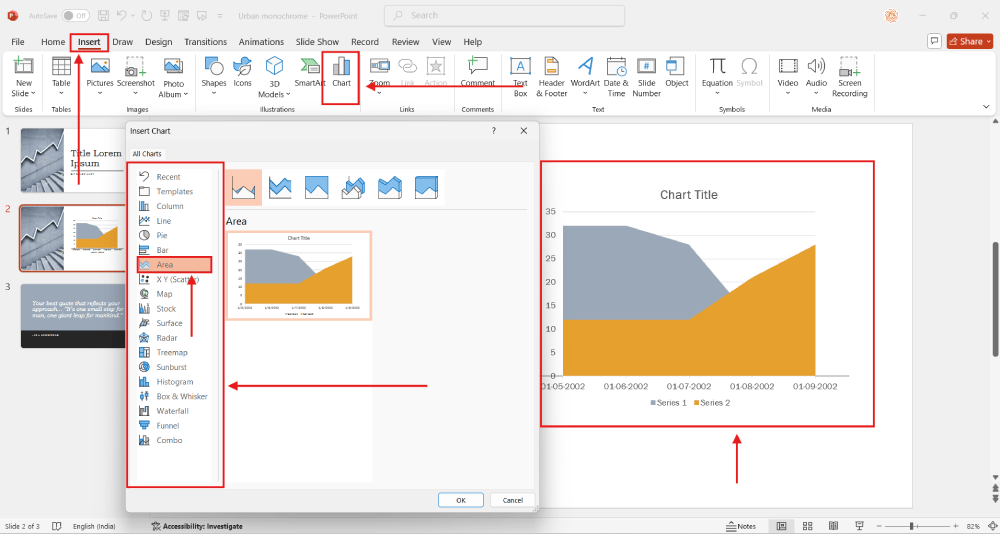
Step 2: Next, Select the ‘Insert’ Tab: Select the ‘Insert’ tab from the top menu. You can add items to your slide using a variety of options on this tab.
Step 3: Select ‘Chart’: One of the options under the ‘Insert’ menu is ‘Chart.’ When you click on it, a new window displaying the various chart kinds will open.
Step 4: Select the Type of Chart You Want: Examine the range of chart options, including scatter plots and bar charts. Choose the type of chart that best represents your data.

Step 5: Enter Data in the Excel Window: An Excel worksheet will open when you select a chart type. Since your data will be the source of your graph, enter it straight into this spreadsheet.
Step 6: Use Chart Tools to Personalize Your Chart: PowerPoint will create a chart that represents your data once you’ve entered it. With the help of the available Chart Tools, you may further alter your chart to fit the theme of your presentation.
Create presentation slides with AI in Seconds in Google Slides
15M+Installs
Works with Google Slides

How to Personalize the PowerPoint Graph?
Making a graph is only half the fight; in order to get the most out of it, you must customize it. To present your graph as a professional visual and customize it for your audience, follow these steps.
Step 1: Select the Graph by Clicking on It: To pick your graph, click on it. The ‘Chart Tools’, which offer a number of customization choices, will be activated by this action.
Step 2: Select the Design and Format Tabs under ‘Chart Tools’: You will see two new tabs at the top once you have chosen your chart: “Design” and “Format.” You may successfully customize your chart with the help of the tools and settings included in these tabs.
Step 3: Modify Chart Elements Such as Legends, Titles, and Labels: Locate the ‘Add Chart Element’ option under the ‘Design’ menu. To make your presentation more clear, you can add or modify chart names, labels, legends, and other elements here.
Step 4: Modify the Colors and Styles of the Charts as You Like: There are numerous pre-made styles available in PowerPoint. Make sure your chart matches the color scheme of your presentation by experimenting with different styles and colors under the ‘Design’ option.
Step 5: Modify the Axes and Data Series Options: The ‘Format’ page has a number of parameters pertaining to data series and axes options that you can change. A more customized presentation that speaks directly to your data is made possible by this flexibility.
This is it! A thorough rundown of the different kinds of graphs that can be made with PowerPoint. You also got comprehensive instructions on how to create and modify these graphs to make them both aesthetically pleasing and educational.
Using these techniques will improve your presentations and help your statistics tell an engaging tale to your audience. Explore PowerPoint now and give those strategies a try!
Check out our Pie Chart Presentation Template to help you create beautiful pie charts.
Create presentation slides with AI in Seconds in Google Slides
- No design skills required
- 3 presentations/month free
- Don’t need to learn a new software
Works with Google Slides

FAQs
What is the data source of my PowerPoint graph?
By default, the data source for PowerPoint graphs is an embedded Excel worksheet. This worksheet allows you to change the data directly.
Can I create a PowerPoint graph using data from an existing Excel file?
Yes, you can attach the chart to an Excel file or copy and paste data from an Excel file into the embedded worksheet.
How can I make changes to my PowerPoint graph’s data?
To access the embedded worksheet, double-click the chart. After that, you can make changes to the data as you would in Excel.
After inserting a chart, how can I alter its type?
After choosing the chart, select “Chart Design” and then “Change Chart Type.” After selecting a different chart type, click “OK.”
How do I give my PowerPoint graph a title?
After choosing the chart, select “Chart Design” and then “Add Chart Element.” Next, enter your title after selecting “Chart Title”.
Can I save an image file of my PowerPoint graph?
It’s true; you can right-click the chart and select “Save as Picture.” After that, you can save it as a JPEG, PNG, or another type of picture.
Where can I locate PowerPoint graph templates?
Pre-made chart templates are available online and in PowerPoint. To view template options, select “New” under the “File” tab.


